Role
Freelance Designer
Industry
Food & Beverage
Location
Raleigh, NC
SERVICES
Brand Strategy
Visual Identity
Brand Guidelines
DELIVERABLES
Logo Family
Typography System
Color Palette
Patterns
Illustration
Packaging Labels
Social Media Templates
Market Booth Collateral
Brand Guidelines
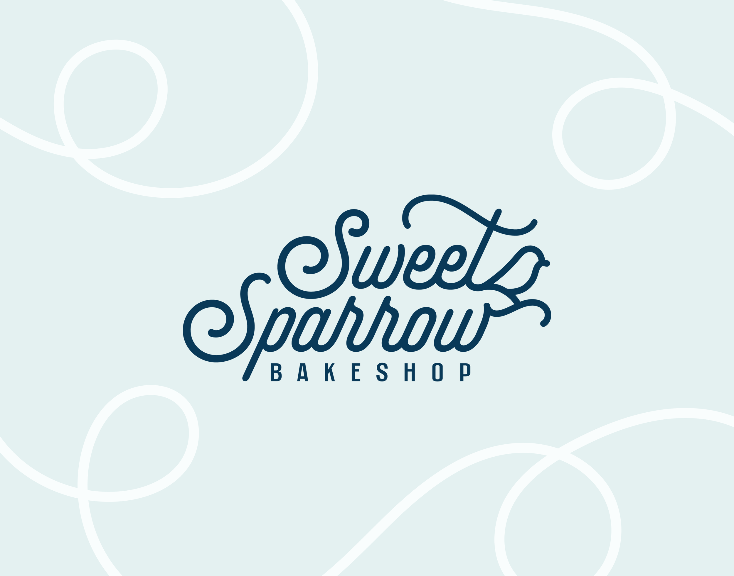
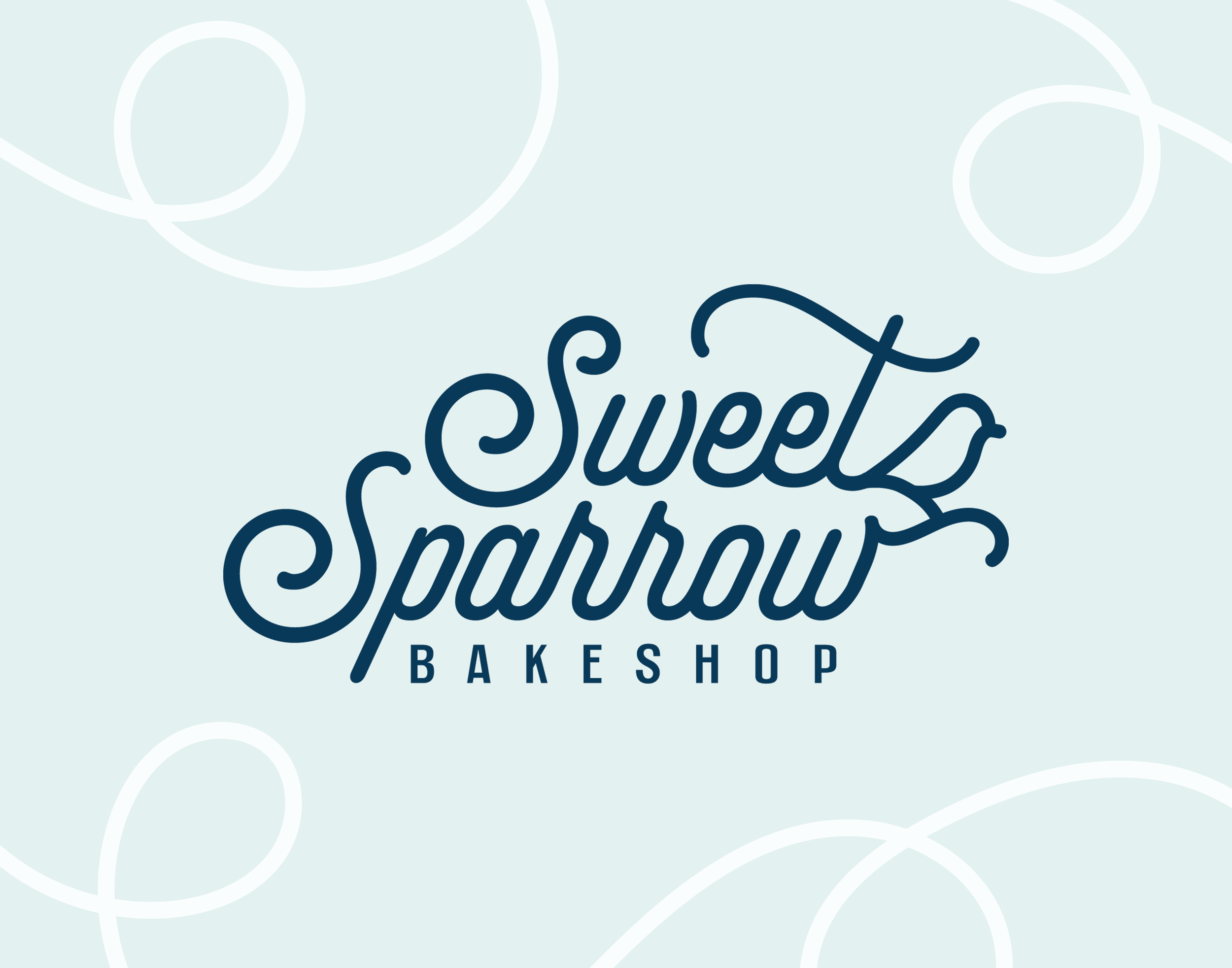
Sweet Sparrow Bakeshop
Establishing the Triangle's go-to bakeshop for handcrafted brioche donuts.
Artisan brioche donut shops all tell roughly the same story: premium ingredients, handcrafted everything, quality you can taste. The category defaults to a visual language that signals craft without expressing it, meaning most brands end up predictably looking like variations of the same visual identity.
Sweet Sparrow Bakeshop was founded to go further than that. Founder Rachel moved from Miami to North Carolina, missed the brioche donuts she grew up eating, found nothing close in the Raleigh area, and grew a business from her kitchen. By 2024, she had a loyal following, a running pre-sale and pop-up operation, and was looking for a retail location. She needed a complete rebrand to carry the business forward and hold its own against established competitors.

Challenge
The brief held a lot of directions at once: Art Deco, Miami warmth, Southern hospitality, playful and modern, and a faith-rooted name that needed to live in the identity without overtaking it. "Art Deco" and "playful and modern" don't naturally land in the same visual category. The first round of logo concepts showed this clearly by leaning traditional Art Deco.
It was important to visually position the business as premium and welcoming, over premium and exclusive. The original direction felt too sophisticated for both the audience and the business. Rather than resolving this tension by choosing between Art Deco or playful and modern, the answer was to reposition the usage of each.
Application
Three months into the project, the scope and business venture shifted. Instead of having its own dedicated space, Sweet Sparrow Bakeshop would be a featured vendor in markets all over the Raleigh-Durham area. The deliverables were adjusted to flexibly support and establish Sweet Sparrow Bakeshop as it scaled.
SOLUTION
The answer was to lean playful and modern in the logo, typography, illustrations, and patterns while alluding to the Miami Art Deco theme in the color palette.
The sparrow, rooted in the brand's origin story, became the anchor of the identity. The typography selection carries the structure and precision that signals quality, working together to produce a brand that earns premium through warmth rather than just signaling it through structure. The balance within the brand carries through every application, communicating warm approachability and artisan craft.
Outcome
Sweet Sparrow Bakeshop launched with a complete identity: logo family, paired typography, color palette, patterns, illustrative elements, social media templates, and print files for various applications. The brand guidelines gave Rachel the foundation to use their brand consistently as the business grew toward a permanent location. They showed up at their first market standing out against competitors in the Triangle and appealing to their target audience.